
Generate Interactive Financial Dashboards from Spreadsheet Data
Step-by-step Instructions
1
Select User Interface Toolkit and Provide Your Prompt
Go to Spaces. Click on the Toolkits button and select the User Interface toolkit from the available options. Then enter your prompt in Chat and press Enter.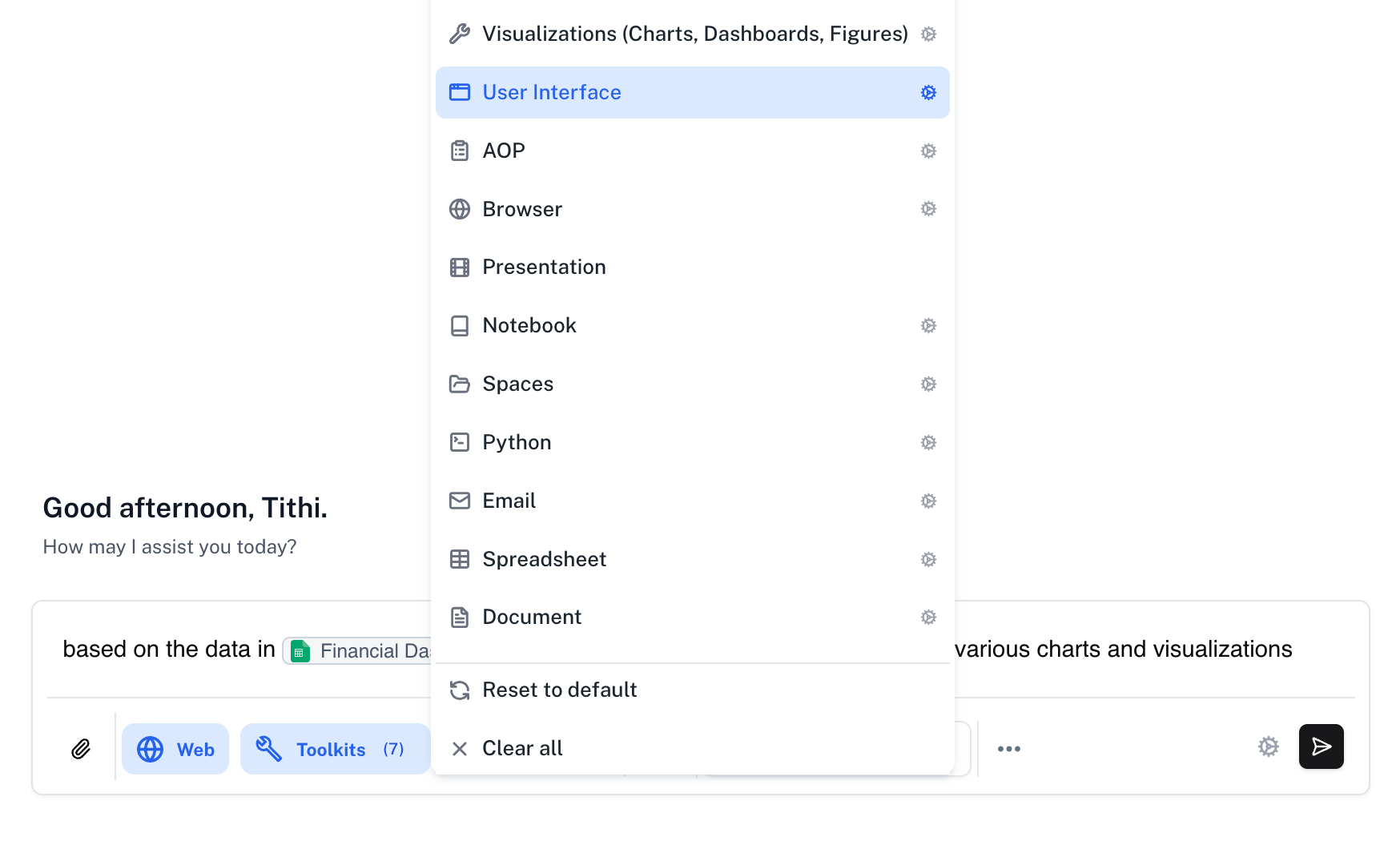
Prompt
2
Review the Generated User Interface Asset
Athena will create an interactive user interface asset that appears in your workspace. The generated dashboard includes multiple visualizations, interactive filters, and a clean, professional layout. These user interface assets support versioning, allowing you to safely return to previous versions if needed. You can view the code implementation on the left panel and the live preview on the right.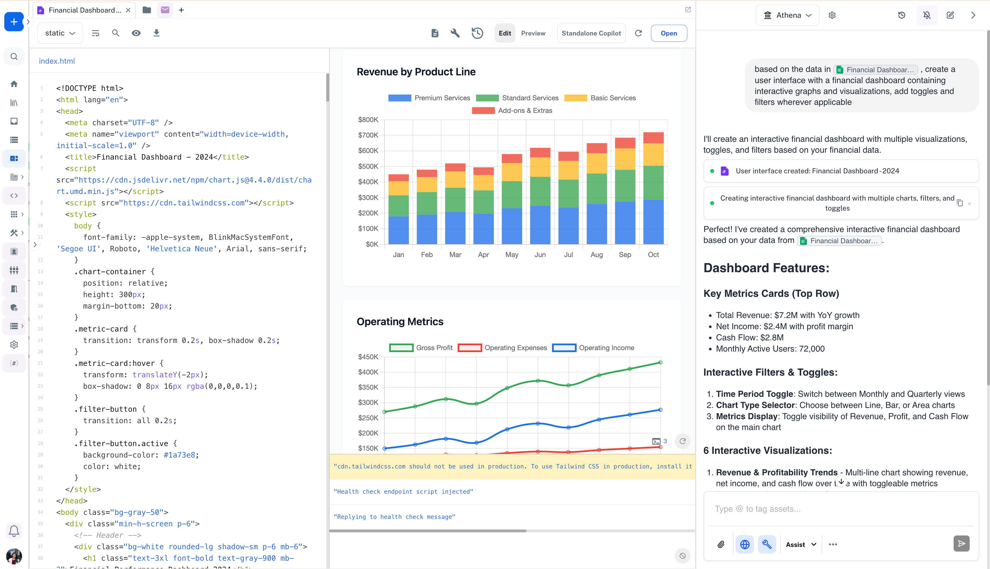
3
Explore the Interactive Dashboard Features
The generated dashboard includes comprehensive features such as key metrics cards displaying total revenue, net income, cash flow, and monthly active users. Interactive filters allow you to toggle between time periods (Monthly/Quarterly), switch chart types (Line/Bar/Area), and control which metrics are displayed. Multiple visualization types are automatically generated including trend lines, stacked bar charts, and comparative views.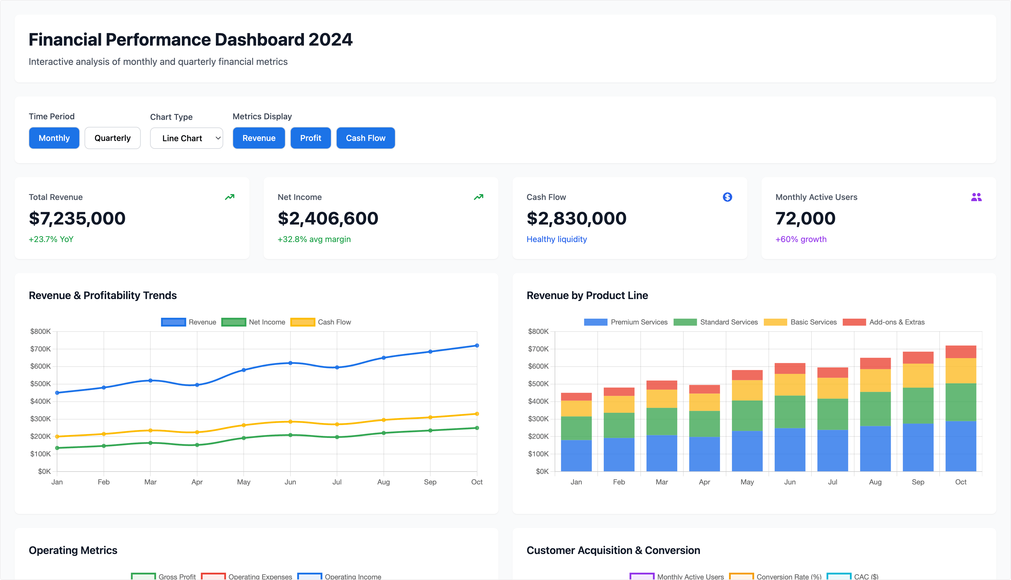
4
Access Additional Visualizations and Share Your Dashboard
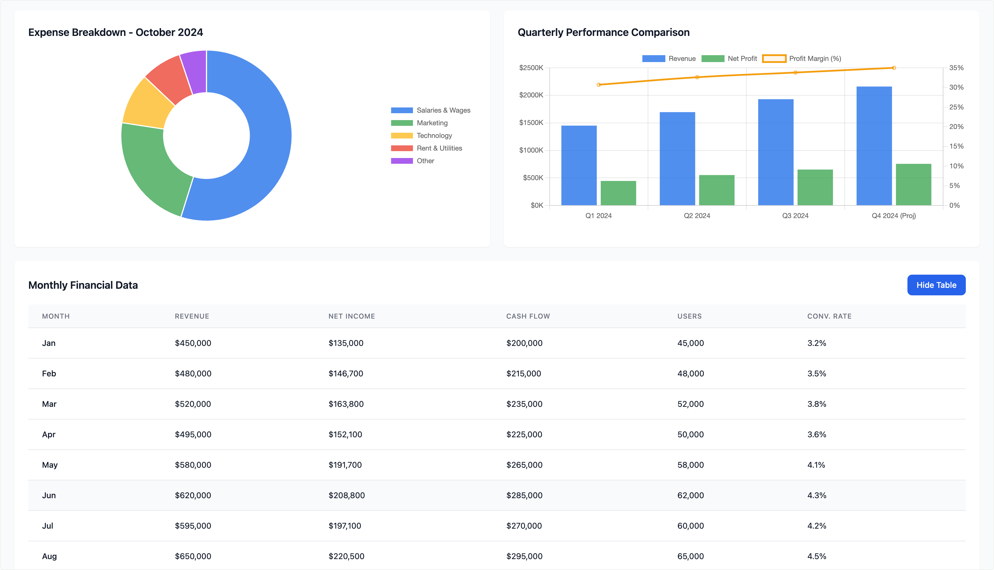
Scroll through the dashboard to view additional visualizations including expense breakdowns, quarterly performance comparisons, and detailed data tables. Each user interface generates an independent shareable link that allows people without Athena access to view and interact with the dashboard. This makes it easy to distribute insights to stakeholders, clients, or team members who don’t have platform access.